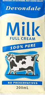
The old logo on a small pack of UHT milk. I prefer the old packaging. It's less cluttered. That old cow has been their mascot for as long as I can remember. The map of Australia in her marking is a nice touch.

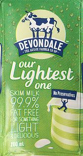
The new logo on a small pack of UHT milk.

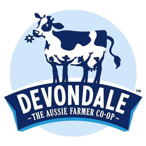
The new logo is odd because although it has a more realistic looking ruminant, if you look at it properly you will see that is four people holding aloft a legless cow. They are her legs and they work together to hold her up. She seems happy enough. The mesage/idea behind it is good but the end result is a little macabre.
No comments:
Post a Comment