Showing posts with label design. Show all posts

Sunday, September 03, 2023

DIY Plastic free, reclaimed aluminium can, plant tags


I work in a bush crew. One of the things I’ve noticed is that in conservation areas on significant plants they use metal swing tags/labels. I assume they are aluminium because the are inscribed and very light, with no corrosion.

I’ve come up with a way to make an economical and weather durable tag with things I have at home. 

This is a project for adults NOT kids. 
The cut aluminium can edges are moderately safe to handle without gloves if done carefully*
Avoid touching/handling the cut edges.
This project CAN NOT be completed with a steel can.


DIY Aluminium Plant Labels

You will need:

A clean aluminium can

A can opener that lifts off the top of the can

Scissors

A slightly rounded, smooth  metal point such as a darning needle. Mine is a metal fondant or wax working tool. 

A smooth blunt object to press folded metal such as a metal spoon. Mine is the other end of the aforementioned tool. 


Use can opener to remove top of can


Use scissors to cut straight along the length of the can. 
Make another parallel cut 4-5cm away from the first.
Cut between the two cuts to seperate from can.


Cut off non-flat sections from each end.

You should now have a rectangle of roughly 5x12cm


With the labelled exterior of the can facing you, fold along one long edge, about 4-5mm deep.

Fold the other long side over so that it slightly overlaps by 3-4 mm over the first fold. 


Make each fold crisp by pressing it.
Fold over from the broad fold, one corner.
Make the corner fold crisp.
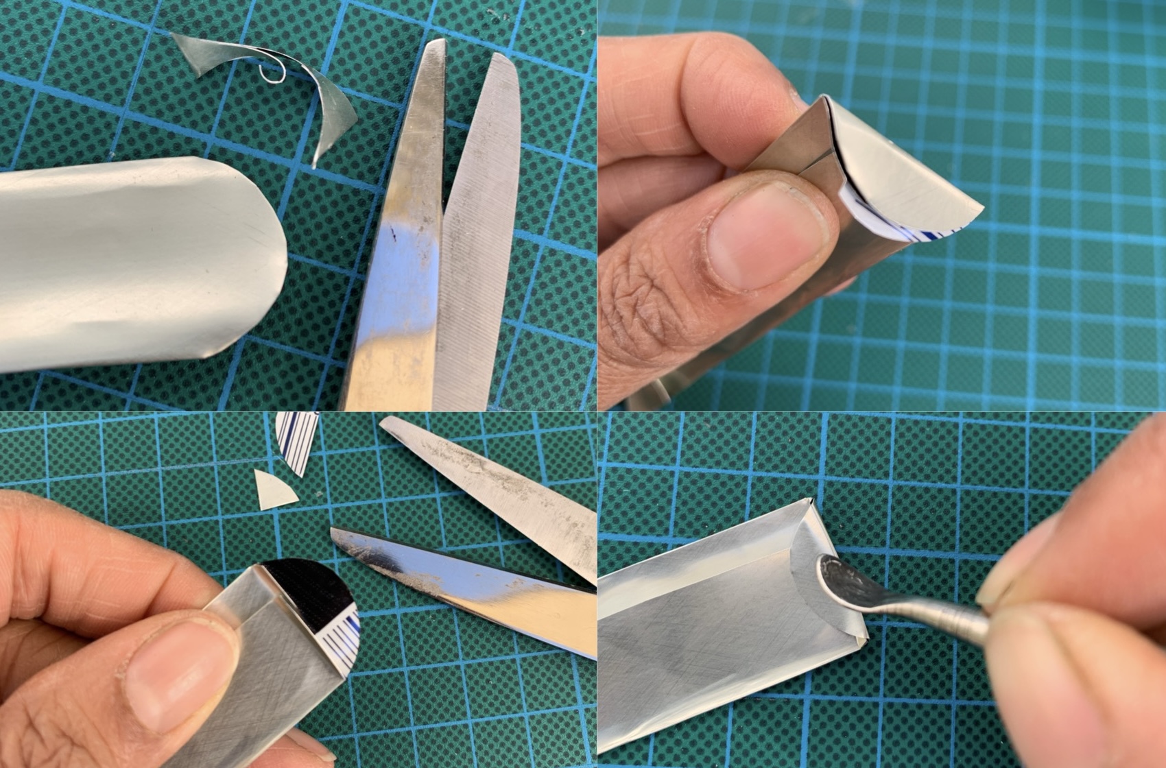

At the other end of the tag, use scissors to cut a semi circle or rounded corners.
Lightly fold over this rounded end towards other folds then fold back.
Snip off folded under layer to leave simple rounded flap.
Fold over rounded flap and press.


Use metal point to carefully write label. You will need to press so keep your lettering small and simple.


Finished!
Gently push into the soil or pot.


Label your plants however is useful to you. As a horticulturalist and revegetation worker, I want to remember the botanical names of the indigenous plants I’m planting. I’m in a rental, so I’m hoping that whoever lives here next will see these tags and respect the indigenous planting.


*While I made two cans worth of labels without cutting myself, others might not be so careful/lucky.  

Friday, April 19, 2013

Devondale's new logo is odd

 photo DevonadaleOLD_zpsd028fbc5.jpg
The old logo on a small pack of UHT milk. I prefer the old packaging. It's less cluttered. That old cow has been their mascot for as long as I can remember. The map of Australia in her marking is a nice touch.

 photo DevondaleNEW_zps4d6431e1.jpg
The new logo on a small pack of UHT milk.

 photo c664bac9-1d69-4182-8fc4-c73aaff579aa_zps61b2d6a5.jpg
The new logo is odd because although it has a more realistic looking ruminant, if you look at it properly you will see that is four people holding aloft a legless cow. They are her legs and they work together to hold her up. She seems happy enough. The mesage/idea behind it is good but the end result is a little macabre.

Wednesday, February 06, 2013

St George Grillmaster Manual

When we moved into our rental property just over a year ago I regarded our electric stove with some uncertainty. I was only familiar with gas stoves and their quick response to change when required. It’s actually a great appliance. You can even buy parts for it online.

 photo cover.jpg

As it turned out the old stove is of an excellent vintage from a highly regarded brand, manufactured in NSW c. 1970s by St George. In one of the drawers of our kitchen was the original manual! The vintage Owner’s Manual includes detailed product specifications and a wiring diagram. Apparently it came with a rotisserie attachment but we have seen no sign of it in our time here.

 photo wiringdiagram.jpg

When we first came upon it my BF read it out loud in a typical 1950s voiceover. We were surprised by the vocabulary for such a document. Manuals these days make such dull reading by comparison. Among other words you don’t usually find in oven/stove top manuals these days are; fierce, imperative, indiscriminate, elapse, depress, abnormal, abovementioned, foregoing, utmost.

 photo MessageOwner.jpg

From the manual for the Grillmaster Model XG370:
‘A Message to the Owner
You are now a possessor of a St. George fully automatic Electric Range, and in order to assist the reader in following the directions more easily we mention hereunder the salient features of the St. George Grillmaster.


Please read this booklet carefully until you are thoroughly conversant with every phase of the range’s operation. This will ensure you obtaining the best results from your range.


Most authorities agree that provided there is ample time a better result is achieved by cooking for a slightly longer period at a slightly lower temperature.


Asbestos mats also should not be used as in each case the heat is trapped around the top of the range and may, after constant misuse in this fashion, cause the vitreous enamel to craze.’

 photo Final-word.jpg


EDIT 15/09/2013 - 27/12/2014
For FULL MANUAL images online CLICK HERE

Friday, June 24, 2011

Funky little lion logo

This is the first of a short series of images scanned from the 1929 annual of The Draper of Australasia. Sure I could have scanned a great many images of the fashion of the time, but let's face it I think we're all quite familiar with that sort of thing. This blog is more about the quirky rather than the quaint. I don't find 1920s fashion particularly exciting anyway.

Photobucket
Trademark, John King and Sons and Glasgow, drapers specialising in curtains
He looks like he's holding up his thistle with a grin, a spring in his step, a slightly flamboyant curl to his mane, and tiny round sunglasses perched on his nose.

Saturday, October 31, 2009

For medicinal purposes

I'd like to show you the coolest piece of furniture I own. Okay, so I don't own a lot but it's still very cool!

Photobucket
This is the $40, vintage, doctor's cabinet I got from my local Salvos. We have a shortage of cupboard space in a our kitchen so this was a welcome addition to our home. I stripped back the paint on the decorative hinges, maker's plaque (a Melbourne manufacturer originally based on Swanston Street) and nifty door clasp. I'm guessing it goes back to the 1950s.

Photobucket
Wheeling it to the car and into the apartment, my brother and I found its squeaky wheels and metallic clunky sound amusing. It reminded me of the UWW (Unidentified Wheeled Whitegood) from the moon in Wallace and Gromit's Grand Day out. So of course I had to put my figurines on there! The measuring glass in the background is from the 1950s and bought for a buck at Savers.

Tuesday, June 16, 2009

My Japanese Ceramics Part 1; Pink Fish Salt Shaker

How many items does it take to call a group of things a collection? Three or four is probably too few, so I won't claim that I have a collection of Japanese ceramics. One of the many things I appreciate in Japanese art is the way the artists capture the essence of an animal in a depiction - the following being a good example.

I'm not sure how old this solitary, Japanese salt shaker is. Circa mid 20th C? It's one of those random quirky objects my father or brother got at a market, I spotted and claimed for my own. I like: the fluidity of its form; the typical piscine, pouty facial expression; the subtility of the glaze. I did a spot of googling and found a complete pair in black. Generally salt shakers have fewer holes so at least this confirms I have the salt and not the pepper.

Photobucket
Photobucket
Photobucket

Sunday, June 14, 2009

London Tubes, 1926

Photobucket
Building a London Tube Station Tunnel.

Photobucket
Building a London Tube Station Tunnel, detail.

Photobucket
An underground Wonder
'These intricate tubes (near Mornington Crescent, London, N.W.) were so accurately laid that when they were joined up (after being started from each end) they fitted within a quarter of an inch. A hundred and sixty trains pass through them in an hour between North and South London.'

Original images and text from : Chatterbox (1926, Children's Annual), published by Wells Gardner, Darton & Co., London 1926. Artist unknown

Thursday, June 04, 2009

Federal Palace Hotel a.k.a. Federal Coffee Palace*

Photobucket
Image source: unknown contemporary magazine/newspaper advertisement c.1897+ Engraved by A.C.

Built in 1886 as a temperance hotel on the south western corner of King and Collins streets, the Federal Coffee Palace served all manner of beverages except alcohol. Its construction was instigated by a leader of the temperance movement in Victoria, James Miriams. It was the finest coffee house in Melbourne attracting visitors from around Australia, the rich and famous including international visitors. The abstinence movement had waned by the early 1890s. In 1897 a liquor license was acquired and it was renamed the Federal Palace Hotel.

The building's design was the result of a competition. The first prize winner, architectural firm Ellerker and Kilburn designed the exterior. The second prize winner, William Pitt designed the interior. Some of Melbourne's finest Victorian buildings were Pitt designs including the still standing Princess Theatre (1887), the Rialto and Olderfleet buildings (1890). The Age newspaper at the time was full of high praise for the building deeming it one of Australia's 'most splendid'.

Photobucket
The lobby interior, entrance from Collins Street*

The FPH was pulled down in 1972-73. For almost seven years after this it was used as a car park before being developed into an office block.

In the 1960s and 70s it was popular to pull down Victorian buildings deemed too large and old fashioned, and replace them with modern office blocks. We lost so many superb Victorian buildings this way though fortunately the National Trust and general public now value and protect our architectural heritage from further erosion.


*Information source, interior image and recommended further reading:
Latta, David, Lost Glories: A Memorial to Forgotten Australian Buildings, Angus and Robertson Publishers, 1986

Saturday, May 09, 2009

Beci Orpin

Listening to: Fearless, by The Bravery, from self-titled.

Photobucket
This artwork by Melbourne artist Beci Orpin appeared in The Age, Sunday Life (?) magazine a few months ago, as part of The Travel Issue. I like the soft colour palette and the sweetly retro clip art. Her website was a pleasure to visit: full of a nostalgic, vintage style, graphic design and art. I have admired her delightful cut paper work at Outre gallery and didn't realise one of my favourite t-shirts (by Genki, red, with 'I love dancing' on it) is by her.

Saturday, March 14, 2009

Bugatti and More: On now at Melbourne's NGV International

I enjoyed visiting both NGV venues this afternoon: I highly recommend the Bugatti show at NGV International! All exhibitions currently on are free so there's no excuse for any art and design loving Melbournian, not to make the time to see both this and the other shows.

Bugatti: Carlo Rembrandt Ettore Jean features Rembrandt's lively, evocative animal bronzes; an automobile each by Carlo and Jean; unique, unusual and beautifully crafted furniture by Carlo. As far as talent goes they were world class - it's remarkable to have so much creatively and ability in one family. I think my favourite piece would be Carlo's assymetrical, throne seat which is part of the NGV collection. There's a touch of steam punk about that and some of his other pieces.

The Satirical Eye: comedy and critique from Hogarth to Daumier, a must for anyone who appreciates vintage satire and etching. Features a number of prints by Goya from his series Los Caprichos.

The cricket and the dragon: Animals in Asian Art
is aimed at getting children interested in art so be prepared to squat and crouch a lot in order to see most of this show properly. Other than that small grumble and inconvenience for the rest of us, there are some superb examples of Asian craftsmanship and artistic technique. The poster critter - literally - for this exhibition is a copper alloy, life sized rat holding a chestnut. He's gorgeous, I want him! There's a lifelike crab also made in copper alloy and Japanese but a slightly later period and not apparently by the same artist.

Don't miss the smallest pieces tucked away behind tiny windows, inset in a graphic panel between each of the main showcases. Some of the best stuff is there. Exquisitely carved Japanese netsuke*, and finely glazed snuff bottles will make that awkward stooping worth your while!

One of the netsuke on display is very similar to one in the V&A collection*. Perhaps this is a traditional depiction of quails or perhaps one inspired the other.This one is cuter, rounder and sweeter. Their eyes are shinier [grabby hands].

Magnifying glasses are there to encourage kids to appreciate the details but for those of us who are long sighted I expect they could come in handy for some of those tiny pieces!

Remaking Fashion was okay but not my cup of tea and held nothing that really excited me. I continue to be frustrated by the recessed showcases and lack of visibility they afford. Fashion isn't designed to be viewed from one specific angle but 360 degrees. The strategic use of mirrors perhaps, and an extra freestanding showcase would help.


*I've always sought this type of carving out every since seeing my first netsuke at the Victoria and Albert museum in London back in 1997. I love how compact, detailed, and full of character they can be.

Monday, November 03, 2008

Skull a Day & Street Anatomy

Photobucket
Bird dropping skull
01/11/08

At Skull a day this bird poo would be described as a simulacra. I spotted it after hopping out of my car yesterday afternoon. You can find more skullish simulacra on Sundays, reader submissions, and the original skulls from each day of a year made by the site's author.

Photobucket
i-Pirate - Now with Skulls!
clay, card, found objects
2008


Admittedly I have found some of the skull simulacra a bit tenous, and sometimes I think the author phoned in the skull for the day. There also isn't many non-human skulls. However skulls like the Chinese calligraphy skull, the chewing gum dot and chalk skulls, and many of the found object ones are so outstandingly nifty that you can easily forgive these things.

Noah Scalin, site author, decided one day to make a skull a day for a year. At times he would struggle to find a new and exciting material, he would come across something unconventional as an art material like petroleum jelly, while on other days something spoke to him, such is the way with art. He dabbled in media he hadn't used for years and challenged himself with new ones. He's been plugging his site book a lot there lately! There's a Facebook application to give your friends skulls each day. So if you like skulls and art you will enjoy Skull a Day.

[edit]

If that doesn't tickle your fancy try the blog, Street Anatomy which has more than artsy skulls. You will find art with street cred, all relating to the anatomy of humans and animals in varying medical depth, some vintage some contemporary, some might not be there tomorrow while others are there for a lifetime, all in a variety of media. Cool stuff for the slightly morbid or scientifically curious art browser, and well worth reading right through to the beginning of this blog's archive.

Thursday, September 04, 2008

Art Deco 1910–1939 @ NGV International

Art Deco 1910–1939 @ NGV International, was extensive with quite a bit of breadth though I must conclude I found a lot of it clunky and a bit heavy visually. The room reconstructions complete with wall decor were retina burning but I guess they were historically accurate. It was like a walk-through art history class and helped me get a better understanding of the style beyond what I already knew.

Best bits: Cartier, Lalique, US streamlining, The Strand hotel revolving door foyer reconstruction, François Pompon’s bronze Polar bear*, car ornaments made of glass, the original Holden lion sculptures. There was an exquisite cut glass vessel from Scandinavia (I think) owned by H.R.H herself. Colourless, it depicted a 360 view of glass house with women attended to some of the many little potted cacti. The detail was amazing.

I had not attended a Winter Masters NGV show before because none of the previous ones were tempting enough. This one swayed me and I felt it was well worth my time and $ :) Looking forward to seeing what the next one will be.


*Featured on lots of the exhibition merchandise in the gift shop. I was disappointed they didn't have 3D versions of him in glass or metal as a miniature perhaps. They just plastered him all over a range of stuff, and some jewellery.

Saturday, April 26, 2008

Diamonds are a gull's best friend...

Isn't this a cool image? Why do I think so? I think it's because it's a bit artsy, like some of the taxidermy art I've seen but it is also commercial. It's elegant and beautifully monotonal despite being a colour image.

Photobucket

I loathe obvious, groan worthy, was-that-supposed-to-be-funny? puns as much as the next person who prefers a higher form of wit. However, this one popped into my head after deciding today that I would finally post this ad I found in a French fashion magazine. This is after having it displayed near my desk for months. I don't normally think in puns or I would have thought of it as soon as I saw it. That's my defence and I'm sticking to it!

[edit 05/06/09]
Having just checked out this particular series of Peter Lippmann's work I am now wondering if this is one of his or was inspired by it?

Sunday, March 30, 2008

Black in Fashion: Mourning to Night

Black in Fashion: Mourning to Night is definitely a worthwhile duo of fashion exhibitions. There's beautifully detailed Victorian dresses, architectual structures, exploration of shape and cuts, a variety of fabrics and surface contrasts best explored in monotone.

My expectations of it were a little topsy turvy - I found the Australian half of it at The Ian Potter Centre more impressive than the international half. It isn’t because the fashion was any better but because I could see it well. The lighting was extremely dim at NGV International. Why should this be when you’re dealing with pieces of the same age and materials? I respect the need for dim lighting of textiles but the disparity between the two shows baffles me.

One showcase had no lights on at all - most likely the light bulb was blown - when we visited on a Sunday afternoon. The space containing these large showcases is designed to cut out most daylight, and has minimal ambient light, so this rendered whatever was in the case invisible. I could just make out what might have been an embroided collar or perhaps an apron. I find this is unacceptable gallery practice for such a prestigious institution.

Most memorable pieces @ the Ian Potter NGV;
Two exquisitely beaded, Victorian mantles,
1950s dresses.
@ at NGV International;
Neoprene dress.

Saturday, March 08, 2008

Advertising Art

Lately I've had access to a broad range of magazines both local and imported. It's got me more interested in fashion and a better understanding or what works/doesn't work and why.

It's a known fact that glossy fashion magazines are largely advertisements with only a small segment having actual content. Yet what fabulous ads they are. The beautifully composed photographs, bold use of colours, shiney and sexy things to covet. The illustrated/arty ads can be particularly striking. Here's a couple that I am loving right now.


Champagne, Spain
From a Spanish magazine
I feel this will inspire a future collage from me. I quite like the coke ad that's around at the moment with a similar composition but this is more my style. Gorgeous!


Photobucket
Moxie Sleepovers, cute kitsch
I don't know who the artist is for this but it's an amusing and striking artwork. Moxie's website is a sweetly feminine, interactive place to visit.

Wednesday, April 13, 2005

24 uses for a little,dead, green man*

I own a piece of Alessi! Why is this so exciting?
Official Alessi Website

Alessi aka The Dream Factory, is an Italian design group that been around since 1921. They started off manufacturing metal tea services. Over the years they have elevated some designers to international fame; Michael Graves, Philippe Starck, as well as Australians Marc Newson (grrrr) and artist Susan Cohn (she designed the cohndom box). Today, Alessi is synonymous with bright, playful - and expensive - homeware.

So how can a Part Time retail worker afford Alessi? Simple: she shops at Savers :D I was wandering through there as I usually do after handing in my fortnightly form to Centrelink (Savers and Centrelink are on opposite sides of the same block here). Saw this funny green man lying on the shelf with a tummy that doubled as a pen holder. Flipped him over and there’s the Alessi logo. Whoah… this is a big deal for a former Industrial Design student to find Alessi going for $3.99 in as new condition. After all of those years of admiring cool stuff that I thought I’d never own.

I’m not a label ho mind you. I gave some thought as to what I was going to do with this dude. Did I have a use for him? Where would he take up pen holding duty? Oh hell with it, figure it out when ya get home, you can finally own Alessi. Wheeeee! He’s looking good next to my computer :)

It was my day at Savers yesterday - and not just for the bright green, Alessi voodoo doll/dead dude that you stick pens into. Noooo. I also found:
~ a velvet trimmed, black, wool felt hat from Italy which, with a bit of sewing in the right spots, I am going to turn into a 3 point hat aka a PIRATE HAT! *excited*
~ some little black gloves, with an embroided detail, with fingers that actually fit my elegantly long digits. They must be an older than they look because they are made in Western Germany.
~ a black, ¾ lace sleeve (fitted then flares/ruffs out in a Baroque/Rococco, late 18th c. style, don’t know technical term) top, with ribbon trim, lace up bodice detail with lace behind that on the front. The cool comfort of a singlet top, with the elegance of flowing sleeves. Needs a little mending. Plan to sew in a satin panel behind the lace detail since you can see bra through lace panel. I don’t want to do a Gwyeneth Paltrow and go without, since that look is no better IMHO.
All of this for $14.95! ‘Twas a good start to my day. I trotted home with a little smile on my face.

Erm, do I sound materialistic with two consecutive posts about 2nd hand acquisitions? Sorry. Just wanted to share my excitement in these purchases. This won’t become a shopping blog. Promise :P

In other news…
Got another MLP (Moondancer is yellow, with red and purple mane, glitter moon and stars on her rump), this time from an Op Shop near my best friend’s house. We were house sitting for him. His was the first house I sat. Have taken care of other people’s animals before. This was more challenging but overall enjoyable.

Have visited Caberet Nocturne @ Dream for the third time and reckon I’m in danger of becoming a regular ;) Looks like I’ve re-entered the scene at an excellent point in time! Good people, good music. *happy sigh*

*Hold 23 pens/pencils/things, plus you could use him as a paper weight