Wednesday, June 24, 2009

Sam Leach - The Margin


Sam Leach, 2009
Reflected Magpie
oil and resin on wood


The above is my favourite piece from a solo show by Sam Leach. The other two reflected animals exhibited are also rather clever although everything in this show is worth slowly perusing. Leach's art is extremely disciplined, perfectly detailed, moodily lit, strongly composed. His pieces are small, so no area of the artwork is neglected of a first class level of finish. I also like how they are coated in resin. It lends the works a greater sense of permanence.

Anyone looking to invest in art would do well to buy one of these. You know how you can tell an artist is going to be big? I was right about Ricky Swallow. Anyone with that amount of skill, a certain personal flair and style, and getting media coverage is going to do very well. Leach also has a piece in the Archibalds, and recently in Mute Relics & Bedevilled Creatures: Constructing an Antipodean Curio Cabinet (finished) at Counihan Gallery next to Brunswick Town Hall.

On until the 27th. Click link for further details.

Tuesday, June 23, 2009

Images from the new Tim Burton Alice in Wonderland film

OMG OMG OMG! [spins about giddy]
Wow these are awesome! [mind blown]
Images from the new Tim Burton Alice in Wonderland film
&
Character shots here.

John Williams, illustrator

Photobucket
John Williams, 1923
Who will win?


The slight Oriental influence in this illustration, particularly in the deer and river, is rather lovely. As a composition it's really interesting in terms of where the foreground is. The flow line as the eye travels over the work is pleasing.

I couldn't find anything about this illustrator or further works due to the plethora of 'John Williams' on the internet even when adding a few extra bits of information to the search. If only he had a quirky name! So in lieu of other works and recognition on the internet,
[tips hat] here's to you John Williams.

Original image from : Chatterbox (1926, Children's Annual), published by Wells Gardner, Darton & Co., London 1926.

Monday, June 22, 2009

Black + White (Shades of Grey)

I have 3 paper collages in the upcoming Black + White (Shades of Grey) show at Pigment Gallery in the CBD. None have been exhibited before and one was created especially for this.

Photobucket
Left to right details from;
Hopping Mouse,
Wild World,
Spectacled Bat.


Opening night: Thursday 25 June 5.30 – 8pm
25 June to 11 July 2009
Pigment Gallery
Level 2
Nicholas Building
37 Swanston St
Corner of Flinders Lane.
Enter via Cathedral Arcade, stairs or elevator.

More of my art here.

Tuesday, June 16, 2009

My Japanese Ceramics Part 1; Pink Fish Salt Shaker

How many items does it take to call a group of things a collection? Three or four is probably too few, so I won't claim that I have a collection of Japanese ceramics. One of the many things I appreciate in Japanese art is the way the artists capture the essence of an animal in a depiction - the following being a good example.

I'm not sure how old this solitary, Japanese salt shaker is. Circa mid 20th C? It's one of those random quirky objects my father or brother got at a market, I spotted and claimed for my own. I like: the fluidity of its form; the typical piscine, pouty facial expression; the subtility of the glaze. I did a spot of googling and found a complete pair in black. Generally salt shakers have fewer holes so at least this confirms I have the salt and not the pepper.

Photobucket
Photobucket
Photobucket

Sunday, June 14, 2009

London Tubes, 1926

Photobucket
Building a London Tube Station Tunnel.

Photobucket
Building a London Tube Station Tunnel, detail.

Photobucket
An underground Wonder
'These intricate tubes (near Mornington Crescent, London, N.W.) were so accurately laid that when they were joined up (after being started from each end) they fitted within a quarter of an inch. A hundred and sixty trains pass through them in an hour between North and South London.'

Original images and text from : Chatterbox (1926, Children's Annual), published by Wells Gardner, Darton & Co., London 1926. Artist unknown

Saturday, June 06, 2009

Why small, why not make bigger pieces?

Often people ask me "Why small, why not make bigger pieces?". There are several reasons both practical and creative.

The creative reasons take the lead for me. I have always liked little things, and details ever since I was a child playing with bugs in the garden or in the classroom with the doll house before school each morning. Many of my favourite artists create small/detailed art. So suppose I have a tendency to conceive of these things since it's what I enjoy. Secondly the found materials I regularly use dictate the scale of the piece in my mind. Proportion and scale are very important to my way of thinking.

The practical side is that thinking about petite projects and making them is easier when you're doing most of it at a desk the size of an A1 page, and other parts on a home workshop bench. However it's more of a happy coincidence than the studio environment actually dictating the scale.

Lastly, the reason many artists choose to work on a smaller scale - particularly painters - is that you can achieve a greater quality of finish over a smaller area, in a quicker time. This allows the artist a lower selling price based on hours put into the work, thus making the art more affordable to those who would like to own it.

Small Works 09 at BSG

I have 3 pieces in the upcoming Small Works 09 show at the Brunswick Street Gallery. This is an open entry show - similar to the annual Linden Gallery Postcard Show - for all media within a 30cm x 30cm x 30cm size.

Photobucket
Left to right, details from:
Roost (mixed media sculpture),
Anatomy of a Loss (mixed media collage), &
All Thing Dark and Beady Eyed (mixed media sculpture).

Small Works 09
19 June to 2 July
Brunswick Street Gallery
Opening Night: 26 June, 6pm onwards
322 Brunswick St, Fitzroy 3065

More of my art here.

Thursday, June 04, 2009

Federal Palace Hotel a.k.a. Federal Coffee Palace*

Photobucket
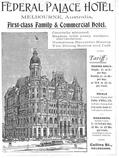
Image source: unknown contemporary magazine/newspaper advertisement c.1897+ Engraved by A.C.

Built in 1886 as a temperance hotel on the south western corner of King and Collins streets, the Federal Coffee Palace served all manner of beverages except alcohol. Its construction was instigated by a leader of the temperance movement in Victoria, James Miriams. It was the finest coffee house in Melbourne attracting visitors from around Australia, the rich and famous including international visitors. The abstinence movement had waned by the early 1890s. In 1897 a liquor license was acquired and it was renamed the Federal Palace Hotel.

The building's design was the result of a competition. The first prize winner, architectural firm Ellerker and Kilburn designed the exterior. The second prize winner, William Pitt designed the interior. Some of Melbourne's finest Victorian buildings were Pitt designs including the still standing Princess Theatre (1887), the Rialto and Olderfleet buildings (1890). The Age newspaper at the time was full of high praise for the building deeming it one of Australia's 'most splendid'.

Photobucket
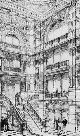
The lobby interior, entrance from Collins Street*

The FPH was pulled down in 1972-73. For almost seven years after this it was used as a car park before being developed into an office block.

In the 1960s and 70s it was popular to pull down Victorian buildings deemed too large and old fashioned, and replace them with modern office blocks. We lost so many superb Victorian buildings this way though fortunately the National Trust and general public now value and protect our architectural heritage from further erosion.


*Information source, interior image and recommended further reading:
Latta, David, Lost Glories: A Memorial to Forgotten Australian Buildings, Angus and Robertson Publishers, 1986